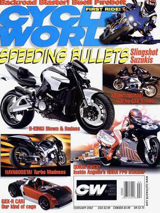
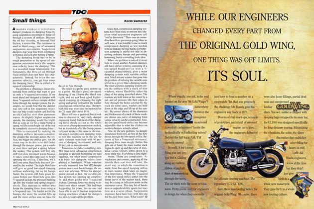
Tdc
TDC
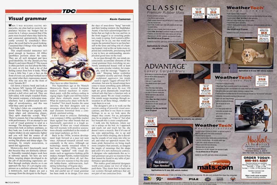
Visual grammar
Kevin Cameron
WHEN I WAS BUILDING RACING MOtorcycles, my plan had no room for appearance because my budget had no room for it. I always assumed that if the parts were located where they had to be, and connected appropriately, then decently covered by somebody’s fiberglass, the result had to be good-looking. I assumed that if things were right, then they’d look right.
This simple-minded innocence isn’t good enough in business. All 600cc sportbikes perform about the same. They are all well designed and have good durability. So why should you buy Brand A and reject Brand Z? The reason is often just how you feel about the bike. It’s cool, or it’s hot. And a lot of that feeling comes from how it looks. When I was a little boy, I saw a face on the front of every car, and had worked out in my mind what their expressions meant. Who can miss the cat on the front of every Yamaha R1 ?
Get down a history book and look at the factory MV Agusta GP roadracers of the classic 1960s. Their fairings are painted a dull silver and red. They are slab-sided, with simple rounded fronts. The parent company, a helicopter manufacturer, had a sophisticated knowledge of aerodynamics, and this was what they came up with.
Yet today’s bikes are completely different. Their fairings are angular, with sharp edges and intersecting planes. They sport shark-like scoops. Why? There’s a reason, but it has nothing to do with performance. It’s an attempt to use a sort of visual grammar to send us a message. The designers know that motorcyclists look at military airplanes, so they look, too. Look at the shapes of the engine intakes on any supersonic fighter and you will find the source of all that angularity-here are dramatic intersecting flat planes and sharp edges. The message, by simple association, is speed and aggression.
Motorcycles don’t functionally need this because they are distinctly subsonic. Smoothly rounded shapes work best at subsonic speeds. Yet here are new bikes, wearing shapes developed to do the job of decelerating supersonic airflow through multiple shocks so it can approach the face of a jet-engine compressor as a uniform subsonic flow. On a motorcycle, such shapes are just a message from the designer to the buyer. They have no other function.
Two Septembers ago at the Munich Motorcycle Show, several European makers showed machines in matteblack paint, with flat surfaces ending in zigzag edges. Eight-year-old boys know what these elements mean: Stealth! What do motorcycles share with the B2 bomber? Not much besides the same universe, but their designers sent us messages about their product, using visual elements borrowed from a completely unrelated setting.
I don’t mean to criticize. Defending your company’s 600cc sportbike market share against four other brands that are functionally equivalent is a tough assignment. If there are visual elements that will resonate with positive associations already established in the minds of your target audience, go for it.
Back in the 1950s, aviation development leapt forward at a pace not seen since. Advanced research aircraft were constantly in the news. Although car technology mostly remained where it had been since the 1930s, new 1950s cars were “updated” with visual elements such as aggressive-looking grille intakes, bumper bombs, rocket-launcher taillight pods, and above all, tail fins. These were new reasons to buy the same old ladder-frame, solid-rear-axle, leafspring technology of bygone days.
Ford has just released its new Thunderbird, and careful use of visual grammar has been made in its design. Ever since the days of nose-down “hung” hot-rods and their leading imitator, the Studebaker Avanti, it has been acknowledged that vehicles that are high in the rear and low in the front suggest to us crouching predators, ready to spring. Ford wanted a different image for its car, one that would not require the potential buyer to see him/herself in the tense and tiring role of a hunting leopard. And so the car looks more reposed and comfortable, proclaiming itself a way to have an undemanding, uncomplicated good time on the road.
As we pass through life, our minds unconsciously accumulate elements of this visual grammar from everything we see. Newly constructed houses with at least one semi-circular window, for example, send the message “Yuppies inside.” Sleeping babies symbolize complete security and trust. Deeply r sculptured aggressive tire treads used to signify rugged off-road SUV adventure, but now by misadventure have come to mean something quite different. Private aircraft that never fly over 150 mph are given dramatically swept-back vertical tails that have a function only at transonic speed. We are visual creatures. Our minds assign meanings through association to all these things, whether we want them to or not.
The designer’s job is to work out the current catalog of powerful visual associations, and then to use them to create feelings in us as we look upon the shapes they create. For us, perception may be as simple as “I like it,” but what lies beneath this is more complicated.
I walk into the bedroom, where our cat is asleep on the bed. As I approach and reach out and touch her fiar, she doesn’t move a muscle. But if it’s one of my sons approaching, she is up and away. Even while sleeping, she is decoding the sounds of our steps into who we are, and what our approach means. Humans pride themselves on being much more complex than animals, so imagine the tangle of meanings that the shape and color of a new motorcycle conveys. A designer who understands this as visual grammar can give us reasons to buy that cannot be found in any table of performance specifications.
This makes good industrial designers worth every penny (or lire) of what is paid them. They know how to hack into our systems through pathways that are not part of our conscious lives.